Sitecore’s Evolution Continues: A Closer Look at XM Cloud Components
 0
0
Originally posted on: https://www.aceik.com.au/insights/xm-cloud-components/
Sitecore recently introduced early access to a powerful new tool within XM Cloud that focuses on building components. This versatile tool goes by various names, including XM Cloud Component Builder, Sitecore’s Front End as a Service (FEaaS), and Sitecore’s Experience Studio. However, for simplicity’s sake, we’ll refer to it as XM Cloud Components in this discussion.
Before diving into our thoughts on XM Cloud Components, let’s talk about FEaaS. FEaaS is all about streamlining and expediting the design and construction of the front-end elements of digital products through the use of cloud-based tools and capabilities. In essence, FEaaS solutions aim to eliminate the need for ongoing code-writing by developers when making front-end changes. This shift empowers non-developer team members to efficiently design, create, and deploy front-end changes putting the focus squarely on the design and user experience. The potential of FEaaS solutions is truly exciting!
Key features commonly associated with FEaaS solutions include:
- Low/No Code Design and Styling Tools: These tools enable the building of user interfaces with minimal or no coding.
- Reusable Component Library: Users can create a library of reusable components, fostering efficiency and consistency.
- Responsive and Cross-Browser/Device Considerations: Ensuring that components work seamlessly across various devices and browsers.
- Accessibility and Performance Considerations: Taking into account accessibility standards and performance optimization.
- Collaboration and Version Control Capabilities: Features that promote teamwork and track changes.
Now, let’s explore our initial impressions and thoughts about XM Cloud Components:

- Bundled Capability with XM Cloud: At present, XM Cloud Components is closely integrated with Sitecore’s XM Cloud. However, it’s important to note that the component-use capability extends beyond XM Cloud, allowing the addition of these components to external applications and websites. In the future, Sitecore may opt to offer this capability independently or integrate it directly with other parts of the Sitecore ecosystem.
- Available in Early Access for XMC Customers: Early access to XM Cloud Components is now accessible to all XMC customers. A more comprehensive and stable release is on the horizon, expected by the year’s end, with the promise of enhanced features and functionalities.
- The Goal of XM Cloud Components: XM Cloud Components aims to provide a self-service platform for non-developers to design, build, and deploy reusable data-source-driven components. These components can be seamlessly added to web pages without the need for coding or management of deployment-related dependencies.
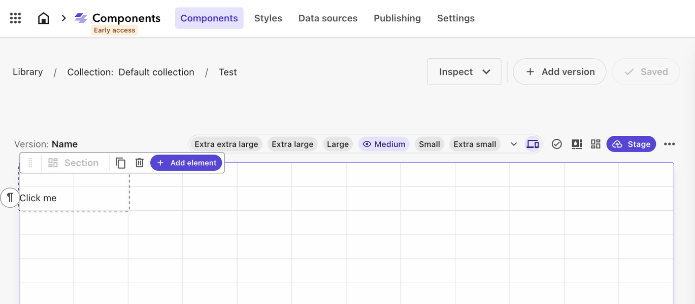
- Key Application Sections: XM Cloud Components consists of several essential sections:

- Styles: This section allows you to define core style elements for building components, encompassing aspects such as color schemes, fonts, layouts, and common structures like cards and buttons.Styles (Themes): Users can create pre-set collections of style elements, referred to as Themes, tailored to represent various aspects of a business, such as different brand identities or key divisions.Data Sources: This area is where you specify data sources used by components, whether they are manually entered JSON data or API-based sources.Components: This section is where you construct the user interface (UI). You can group components into collections and build them on a visual canvas, offering extensive capabilities for a code-free UI development experience.Publishing: Managing the status and availability of components is handled in this section.Settings: Users have various options for sharing and integrations, making XM Cloud Components a versatile tool for diverse project needs.
- External Data Sources and Integration: XM Cloud Components facilitate the inclusion of external data sources through API keys, making integration straightforward. It also provides guidance for pulling in an external component library.
- Embedding XM Cloud Components Externally: These components are adaptable and can be embedded in various external locations, broadening their utility across different platforms and systems.
- Built Using Sitecore’s Blok Design System: The Component builder is constructed using Sitecore’s product design system called Blok, which is itself based on Chakra UI. This means that components created with the Component builder inherently rely on Chakra UI, ensuring consistency and adhering to Sitecore’s standard approach in its composable products. See https://blok.sitecore.com/

- Rapid Feature Development: It’s important to acknowledge that XM Cloud Components is evolving quickly. Screenshots, product references, and even capabilities may change in the near future. However, Sitecore is committed to supporting and maintaining functional components created using the current version.
- Product Roadmap: The product’s roadmap seems likely to include additional pre-built components with powerful, configurable integrations. These integrations will seamlessly mesh with Sitecore’s composable stack, including features related to Sitecore Search and Order Cloud, enhancing the platform’s adaptability and utility.
In conclusion, our initial impression of Sitecore’s XM Cloud Components is one filled with promise. If realized, it could mark a significant evolution in website authoring and management. Empowering non-developers to swiftly design, implement, and manage website user experiences via a component library represents a substantial step forward in digital maturity, benefiting organizations already using Sitecore or those contemplating a transition in this direction.
See Sitecore’s documentation for more – https://doc.sitecore.com/xmc/en/users/xm-cloud/build-components.html